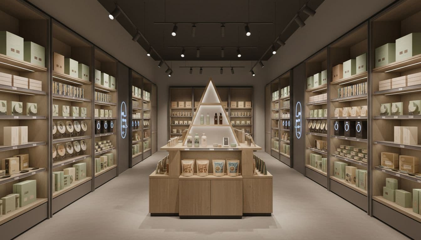
Retail POS / POP Packaging and Displays: Focus on What Matters in 2025
Shoppers make decisions in seconds, so your Retail POS / POP Packaging and Displays have to work fast. We’re talking about the signs, shippers, floor stands, end caps, counter units, and product packaging that sit near checkout or in high-traffic aisles. These are the touchpoints that nudge a shopper from “maybe” to “yes” right at the shelf.
The problem is, many brands spread their budget across too many items that look nice, but do little for sales. Money gets tied up in complex structures, extra print finishes, and one-off concepts that are hard to execute in real stores. Retail teams then struggle to set them up, so displays sit in the back room, or hit the floor late and half-built.
In 2025, the brands that win are focusing on what actually moves product: clarity, quick impact, sustainability, and simple in-store execution. Clear, bold messaging helps shoppers know what the product is and why it matters in a glance. Cleaner structures and smarter materials keep costs in line while still hitting retailer standards and shopper expectations.
This post will walk through how to plan smarter POS and POP so your programs are easier to set up, more on-brand, and more profitable. You’ll see how to trim the noise and double down on the few elements that drive trial and repeat orders. If you need a partner to help bring those plans to life, you can tap into MSL POS packaging and display solutions for real-world assembly and execution support.
What Retail POS / POP Packaging and Displays Really Need to Do

Retail POS / POP Packaging and Displays only have a few core jobs, but they have to do them very well. When you plan around these jobs, you stop guessing and start building displays that actually sell product, not just win design awards.
Think of each unit as a quick, focused system: grab attention, make the value obvious, then guide the shopper to pick it up or add it to the basket.
Win attention in seconds at the shelf or checkout
Most shoppers move fast. They scan, not study. In a busy aisle or crowded checkout lane, your display has to interrupt that scan in a fraction of a second.
That first job is simple: get noticed from a distance, then be easy to understand up close. Good displays do this with:
- Strong visual hierarchy so the eye knows where to look first.
- High contrast between background and type so words pop.
- Clear focal points like a hero product image or bold shape.
In practice, this often means:
- Bold, brand-right color that jumps off a cluttered aisle.
- Simple, large headlines shoppers can read while walking.
- Real product visible through the packaging or open-front trays.
Cluttered stores and short dwell times punish weak design. If your Retail POS / POP Packaging and Displays blend in, they might as well not be there. Displays that stand tall, keep graphics clean, and show the product clearly have a much better shot at pulling a shopper over from 10 or 15 feet away. If you want ideas on how structure supports this, look at how shelf-ready packaging solutions for retail balance function and visibility.
Make the value clear with simple, benefit-first messaging
Once you win the glance, the next job is to answer three questions fast:
- What is this?
- Who is it for?
- Why should I buy it now?
Your headline and short support copy should do almost all of that work. Aim for:
- One short, bold headline.
- One key benefit stated in plain language.
- One main call to action, like “Try it today” or “2 for $5”.
Too many claims, seals, and tiny copy blocks confuse people. Shoppers will not lean in to read a wall of text in store. When in doubt, cut words, then increase type size.
A helpful rule: if a shopper cannot grasp the offer in three seconds, it is too complex. Save the long story for your website or social channels. At the point of sale, you just need a clear promise and a clear reason to act right now.
Guide shoppers from awareness to action at the point of purchase
Great POS and POP does more than look good. It acts like a small, silent salesperson that stands in the aisle all day.
Your display should:
- Support trial with small sizes or “new” callouts.
- Encourage impulse buys with simple deals and easy reach.
- Remove friction by making price, quantity, and use case obvious.
Key tactics that help:
- Clear pricing printed where the eye naturally lands.
- Visible offers, like “Buy 1, Get 1 50% Off” or “Limited Time”.
- Product out of the package when possible, so shoppers can see size, color, or texture.
Many shoppers research online, then decide in store. When your Retail POS / POP Packaging and Displays echo what they saw on a product page or ad, it feels familiar and safe. The job of the display is to close that loop, reassure them they picked the right item, and make the final step easy: grab, place in cart, and head to checkout.
Focusing On What Matters Most When Planning POS / POP

Before you sketch a structure or pick a finish, you need a tight plan. A handful of choices, made early and clearly, will drive most of the results from your Retail POS / POP Packaging and Displays. Think of this section as a short checklist for your team to align on before any designer opens their software.
There are four inputs that matter more than anything else: the goal, the shopper behavior, the retail environment, and the budget and timing guardrails. When marketing, shopper, sales, and operations teams agree on these, every creative decision gets easier and faster.
Lock these down first, then you can layer in color, structure, and new ideas with confidence instead of guesswork.
Start with one clear goal for each display or package
Every display should have one job, not five. Decide what that primary job is, then build everything around it.
Common goals include:
- Trial of a new or improved product
- Trade‑up to a larger size or premium tier
- Cross‑sell a logical companion product
- Impulse grab at checkout
- New product awareness
- Seasonal feature or limited run
When a single unit tries to do all of these at once, the message blurs and performance drops. Shoppers do not have time to decode a busy display.
Have your team write a short, one‑sentence design brief such as: “Drive trial of the new citrus flavor with a grab‑and‑go, eye‑level shipper near checkout.”
Use that sentence as a filter. If a headline, graphic, or structure idea does not support that goal, cut it. This simple habit keeps Retail POS / POP Packaging and Displays focused and easier to approve.
Design around real shopper behavior and decision moments
Your best ideas come from real shopper behavior, not from the conference room. Start by mapping where and how people decide in your category.
Are they:
- Making a fast grab at checkout?
- Comparing options on a crowded shelf?
- Adding a last‑minute treat near the register?
Then ask a few plain questions:
- What problem are they trying to solve right here?
- What will make them trust us quickly?
- What could cause them to hesitate or walk away?
Those answers should shape:
- Layout, such as product at hand height for quick reach
- Copy, with short, benefit‑led headlines and simple claims
- Product visibility, so they can see flavor, size, or format at a glance
If you need a deeper reset on how packaging drives in‑store choices, why point‑of‑purchase (POP) packaging matters is a useful reference for your team.
Match your Retail POS / POP packaging and displays to the store environment
A single design will not behave the same way in a big‑box store, a club, a grocery aisle, and a small specialty shop. Store context changes what works.
Key factors to review with your sales or retail partners:
- Aisle width and shopper traffic
- Sight lines from 10 to 20 feet away
- Lighting quality and color
- Store rules on height, materials, and branding
- How often staff can restock or straighten displays
Use those answers to set practical specs: footprint, height, facing count, and orientation. The right choice is usually the unit that is easiest for staff to place, fill, and keep looking good, not the most complex structure.
Loop in your print and display partner early. Ask them outright which designs are quickest for store teams to set up and which styles tend to stay on the floor instead of landing in the back room.
Balance impact, cost, and speed to market
Eye‑catching is important, but it has to live within real budgets and timelines. You will get better results by balancing impact with cost and speed, instead of chasing the flashiest idea.
Big drivers of cost and lead time include:
- Material choices, such as heavy board vs lighter corrugate
- Number of print versions for different retailers or regions
- Complexity of die cuts and assembly steps
Often, a smart move is to focus spend on a few high‑impact placements in priority accounts, then support the rest with a simpler, standardized kit. This keeps your look consistent and your spend tight.
Bring operations and procurement into the planning stage, not the sign‑off stage. When they help shape specs early, you avoid last‑minute surprises, rework, or delays that can push Retail POS / POP Packaging and Displays past key reset dates. For inspiration on where design is heading next, share an article on 2025 trends in POS display design and manufacturing with your cross‑functional team.
Design Choices That Matter Most for Retail POS / POP Packaging and Displays

This is where strategy turns into what shoppers actually see and touch. In 2025, the Retail POS / POP Packaging and Displays that win are the ones that feel simple, clear, and easy to shop. Good design helps people spot your product, understand the value, and grab it without thinking too hard.
The goal is not to show everything your brand can do. The goal is to show the one thing that moves a shopper to act right now.
Keep the design clean so shoppers see the product and message first
For Retail POS / POP Packaging and Displays, less really is more in 2025. Stores are packed with color, claims, and signs. A clean display becomes a visual “breather” that draws the eye in.
White space is not wasted space. It gives your key elements room to stand out and helps the brain process information faster. Simple backgrounds and open areas around headlines and packs create clear focus.
A strong visual hierarchy keeps your design honest and easy to read. A simple order that works well:
- Brand (logo or wordmark, large enough to recognize at a glance)
- Main benefit (short line that explains why it matters)
- Product image or real product (so size and format are obvious)
- Call to action (what you want them to do right now)
If a shopper can take in those four pieces in three seconds, you are in a good place.
To keep that focus, cut anything that does not earn its spot:
- Extra partner logos or seals that do not affect the buy
- Long copy blocks about brand history or minor details
- Tiny icons or badges that are too small to read
- Background patterns that fight with your headline or product
- Repeated taglines in multiple spots on the same display
A good test: shrink your layout to a small thumbnail and squint. If you still see brand, benefit, product, and call to action, the design is working. If you only see noise, edit again.
Use color, structure, and materials to stand out, not to distract
Color should help shoppers find you fast, not confuse them. Start with your core brand colors, then look at the shelf or category you will sit in. Pick accents that contrast with that environment so your display does not blend into a wall of sameness.
High contrast between the background and type is more important than fancy gradients. Dark type on a light field, or light type on a dark block, beats complex color blends every time in store conditions.
Structure also plays a big role in visibility and shopability:
- Header cards that rise above the shelf line help shoppers spot you from a distance.
- Built-in shelves or trays keep packs aligned so the display always looks full and easy to shop.
- Simple cutouts or die-cut windows can frame the hero product or highlight a key benefit zone.
You do not need wild shapes to stand out. Often, one smart structural move, like an angled front or stepped shelves, creates enough difference while staying easy to pack and ship.
Materials and finishes should signal quality without making the unit fragile or hard to build. A slightly heavier board on key touch areas, a matte finish to cut glare, or a gloss hit on the hero product zone can lift perception without driving complexity.
Small structural tweaks, tested in store or in a mock aisle, can make stocking faster too. Slightly taller side walls, better finger gaps, or clearer pack dividers help both shoppers and staff.
Make setup, stocking, and teardown easy for store teams
If store teams struggle with your display, it will sit in the back room or get tossed early. Even the best creative fails if the unit is hard to build, stock, or keep full.
Design for real store life:
- Use clear, picture-based assembly instructions printed right on the shipper or inside panel.
- Number parts in the order they should be used, and match that order to the instructions.
- Design strong tabs, slots, and connection points that can handle multiple restocks.
Pre-packed shippers and modular displays can be a big help. If staff can cut open a case, fold a few flaps, and roll the display right to the floor, compliance goes up. Modular units that snap together or stack allow stores of different sizes to scale up or down without custom work.
When setup is fast and stocking is simple, you get:
- More displays built and placed on time
- Units kept full more often
- Cleaner presentation all week, not just on day one
All of that turns into better sales in real stores, not just nice photos in a deck.
Add smart details: QR codes, simple icons, and clear calls to action
Smart details should support the core message, not steal the show. In 2025, shoppers expect quick access to more information, but they will not work hard to get it.
QR codes are useful when they link to something short and helpful, like:
- A 15 to 30 second product demo
- A simple how-to or recipe
- A page with real reviews or quick comparisons
Place the code low enough to scan, large enough to read, and leave quiet space around it. Add a short label so people know what they get when they scan.
A small set of well-designed icons can replace lines of copy. Use them to show flavor types, key benefits, usage moments, or formats. Keep the style simple and consistent with the rest of your Retail POS / POP Packaging and Displays.
Above all, keep one main call to action that fits the shopper moment, such as:
- “Try it today” for new items
- “Grab and go” for checkout displays
- “Stock up and save” for bulk or promo units
When every detail supports that single action, shoppers do not have to think. They just act.
Sustainability, Durability, and Compliance: Getting the Fundamentals Right
In 2025, sustainability and durability are not extras for Retail POS / POP Packaging and Displays. They are part of what matters most, right alongside branding, cost, and speed. Smart material choices protect the planet, keep products safe, and send a strong signal about your brand values.
When you get the fundamentals right, you cut waste, avoid rework, and stay in line with fast-changing rules from both retailers and regulators.
Choose materials that are both eco-friendly and fit for real-world use
The shift to greener materials is in full swing. Most brands are moving toward:
- Recycled board instead of only virgin fibers
- Recyclable substrates like paper-based corrugate and mono-material plastics
- Low-VOC and water-based inks that support sustainability goals
The catch is simple. Displays still have to survive truck rides, warehouse handling, and weeks of in-store traffic. A lighter board might look good on a spec sheet, but if it crushes on pallet three, you have lost both money and credibility.
Think in terms of balance:
- Use recycled or lighter-weight board where you can, but reinforce high-stress areas such as base trays, corners, and connection points.
- Pair sustainable materials with smart engineering instead of just “thinning” everything.
- Consider the full journey, from co-packer to aisle, not just the shelf photo.
Brands that take shipping impact seriously often look at broader packaging choices, not just displays. If your team is rethinking transport, it helps to study how sustainable packaging reduces shipping emissions across the whole supply chain: Sustainable Packaging & How It Can Help To Reduce The Impact Of Shipping On The Environment.
Stress testing is where theory meets reality. Before you roll out a national program, you should:
- Build full-size working prototypes.
- Load them with actual product weight.
- Run ship tests, including vibration, stacking, and drop tests.
- Simulate in-store abuse, like repeated restocking and shopper contact.
Your goal is simple. The display should look solid and safe on the last day of the promotion, not just on the first. When green materials and strong structure work together, you protect both your brand and your sustainability story.
Design for easy recycling and minimal waste
If a display looks “green” but is hard to recycle, store teams will toss it. In practice, the easiest way to boost recycling is to simplify.
You can guide design choices with a few rules:
- Cut mixed materials where you can. Avoid plastic clips, foam cores, metal bars, and laminated films that cannot be separated.
- Stick to mono-material builds, like all-corrugate or all-paperboard, so store staff can drop the whole unit into one stream.
- Avoid glued-on parts that hide different substrates or small plastic add-ons that contaminate the bale.
End-of-life is part of design, not an afterthought. Plan from day one for what happens when the promotion ends. Clear, simple communication helps:
- Print recycling icons and short instructions on the back panel or inside flap.
- Use plain language, such as “Break down and place in OCC recycling” or “Remove plastic hooks, recycle cardboard.”
- Keep the teardown steps under three moves: flatten, sort, toss.
Retailers are under more pressure than ever to hit their own waste and recycling targets. Many buyers now ask if POS and POP are fully recyclable, and some will reject complex, hard-to-sort builds. Clean, mono-material displays keep you aligned with retailer scorecards and emerging environmental rules in 2025.
Stay ahead of retailer rules and packaging regulations
The compliance bar is rising fast. Large chains and new laws are changing how Retail POS / POP Packaging and Displays must be built, labeled, and reported.
Extended Producer Responsibility (EPR) laws are rolling out in more US states. These rules shift the cost of packaging waste from cities to producers and brands. In practice, that often means:
- Paying fees based on material types and weights
- Meeting recyclability or reuse targets for packaging and displays
- Tracking and reporting packaging data by state or market
At the same time, major retailers like Walmart and Target are tightening their own packaging standards. They want displays that are recyclable, right-sized, and backed by accurate data. If your POS kit does not match their rules, it can be delayed, rejected, or hit with extra fees.
You do not have to manage this alone. A strong packaging and display partner that lives in this space can:
- Track new laws and retailer standards as they change
- Guide material choices that reduce EPR costs and waste
- Build standard structures that can be reused across programs and retailers
- Support the data and reporting you need for compliance
For many brands, that partner is an efficient contract packaging provider that already designs around sustainability and regulation: Efficient contract packaging and compliance strategies.
The goal is to avoid last-minute surprises, like finding out a month before launch that a display is not compliant in a key state. When you plan for sustainability, durability, and compliance as a single system, you build long-term programs instead of scrambling for one-off fixes every year.
Measuring What Matters: How to Know If Your POS / POP Is Working

If you are spending real money on Retail POS / POP Packaging and Displays, you should know what you are getting back. You do not need a complex dashboard or a data science team. You just need a few clear numbers, a simple way to track them, and a habit of learning from each program.
When you close that loop every time, each new display gets sharper, faster, and more profitable.
Pick a few clear KPIs before you brief the design
The time to pick your metrics is before anyone starts sketching. Clear KPIs guide the design, the offer, and the conversation with your retailers. They also stop the team from arguing later about whether the display “worked.”
Here are simple, practical measures that most brands can track:
- Unit lift vs. control stores: Compare unit sales in stores with the display to similar stores without it.
- Sell-through rate: Look at how fast product moves through the display over the promotion window.
- Days on floor: Track how long the unit actually sits shoppable on the floor, not just the planned dates.
- Compliance rate: Measure what percent of shipped units were built and placed on time.
- Average basket size when active: Check if baskets with your product grow when the display is up.
You do not need all of these at once. Pick two or three that match the goal for that specific Retail POS / POP Packaging and Displays program. For a trial push, unit lift and sell-through might matter most. For a complex floor stand, days on floor and compliance rate are often key.
Write those KPIs and targets into the brief. After the program ends, recap results against those numbers in a short one-page summary. Save it where marketing, sales, and shopper teams can find it for the next wave.
Learn from tests, pilots, and store feedback
Big national launches are expensive. When you can, start with a small pilot in a few chains or regions. Use that pilot to test the structure, the message, and the offer in real stores, not just on a screen.
Ask store managers and field teams for quick, direct feedback. Focus on:
- Ease and speed of setup
- How well the display holds up on the floor
- How shoppers react, even anecdotally
Short comments like “this one took 30 minutes to build” or “shoppers kept bumping it” are gold. Have reps take clear photos of units on day one, mid-promo, and near the end. Note where the display sits, how full it looks, and whether the graphics still feel clean and readable.
These photos and notes often reveal issues you would never catch in the office. Maybe the header is blocked by a beam. Maybe the color vanishes under harsh lighting. Use what the store is telling you to tune the next version.
Turn insights into better future Retail POS / POP packaging and displays
Every campaign should feed a simple playbook for your brand. Think of it as your internal cheat sheet for what works, by channel and by retailer.
Track patterns over time, such as:
- Winning formats like slim shippers, half-pallets, or counter units
- Headline styles that pull, such as price-first, benefit-first, or urgency-led lines
- Color approaches that stand out in each category
- Material and structural choices that survive the full promo and are easy to set
You do not need a huge report. A shared slide deck or one-page template is enough. For each program, add a few bullets on what to repeat and what to stop doing.
When you build this habit, you stop starting from zero every season. Your team moves faster, wastes less money on unproven ideas, and stacks more wins over time. The result is a smarter, tighter system for Retail POS / POP Packaging and Displays that keeps improving with every placement.
Conclusion
Retail POS / POP Packaging and Displays work best when they focus on a few things that matter most. Clear goals, shopper-first design, and simple, bold visuals give every display a job and make it easy for people to say yes at the shelf. When your team aligns on one main outcome for each unit, every headline, color choice, and structure decision gets sharper and faster.
Real impact also comes from what shoppers and store teams experience. Displays that set up in minutes, stock cleanly, and survive the full promo window build trust with both retailers and customers. Smart material choices, recyclable builds, and basic testing keep your units looking strong while supporting your sustainability story. When you add simple measurement on the back end, you learn which ideas to grow and which to drop.
Now is a good time to review your current POS and POP programs with a hard filter. Keep what clearly drives attention, trust, and sell-through. Cut the clutter, the over-designed units, and the pieces that are hard to build or track. Then reinvest that budget into fewer, stronger, high-impact placements backed by real performance data.
If you want support tightening that system from concept to floor, look at how MSL’s end-to-end POP packaging and fulfillment solutions tie design, assembly, and distribution together. Start your next display program with a clear brief, a simple structure, and a plan to measure results. Your future launches will be easier to execute, easier to scale, and much more profitable.