
9 Retail Display Ideas to Catch Shoppers’ Attention in 2026
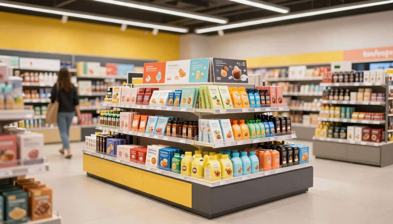
In a busy store, shoppers make quick choices among products competing for their attention. A strong retail display helps them notice an item and understand its value through clear design, useful placement, and easy access, not bright graphics alone.
The best approach depends on what you’re selling, where the display will sit, and what your campaign needs to achieve. These nine ideas can help you shape a display that fits those conditions, with retail point-of-purchase display design as a useful starting point for clear, shopper-friendly presentation.
Key Takeaways
- Match the display format to the product, store layout, and campaign goal. See our end cap display design guide for one common format.
- Use a clear message, strong visual contrast, and easy-to-reach products so shoppers can understand the offer quickly. Visual merchandising research examines how store presentation shapes shopper responses.
- Place displays where they fit the shopping journey, but remember that visibility alone doesn’t guarantee a purchase.
- Before launch, choose two or three measures, such as sell-through, basket size, and setup compliance. Compare results with a baseline and review store photos to understand execution.
Retail Display Ideas to Catch Shoppers’ Attention
The first three ideas focus on winning a shopper’s first glance, then making the featured product easy to understand and reach. A display earns attention when its message, format, and placement fit the store.
Use clean graphics and one clear message
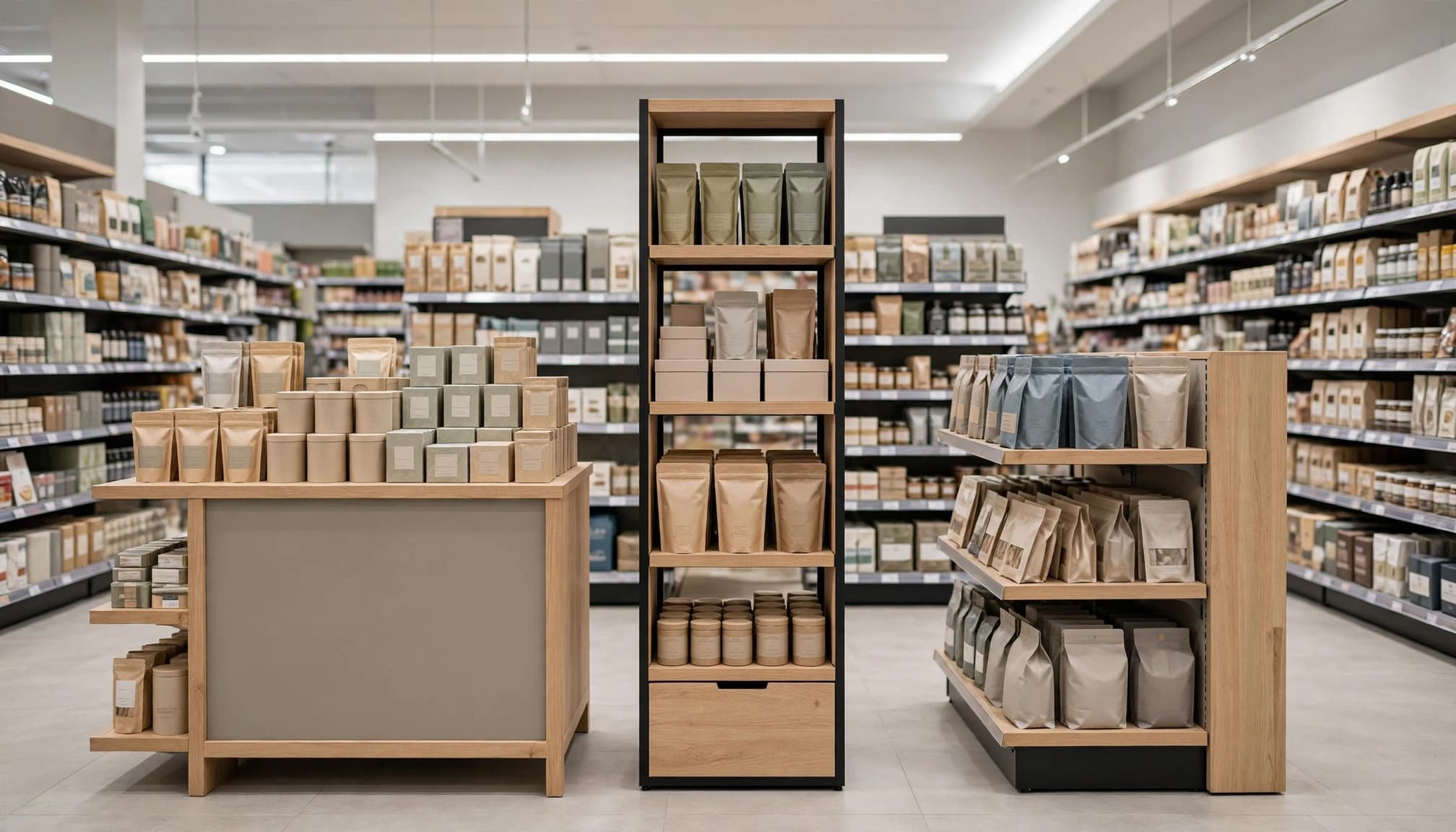
Shoppers scan shelves quickly, so a display needs a clear visual order. Lead with one benefit or offer, set it in readable type, and use strong contrast to separate it from nearby products. Intentional white space gives the message room to stand out instead of competing with a busy background.
Keep the product visible, too. A clear package view or open-front tray helps shoppers connect the message to the item. Avoid stacking several claims, promotions, and product features together; too much copy can make even a useful offer harder to grasp. For example, a display promoting a new snack could focus on its flavor or a simple introductory offer, rather than listing every product attribute.
Choose a display format that fits the store zone
The right format depends on the product, assortment, and shopping moment. Counter displays can put small add-on items near checkout, where shoppers may have time for a quick purchase. Endcaps give promoted products visibility at the end of an aisle, while floor stands allow more room for a larger assortment. See our guide to retail floor display formats and design for more planning considerations.
High-traffic locations can help shoppers notice a display, but placement also needs to suit the category and store layout. A product positioned beside related items may feel more relevant than one placed in an unrelated aisle. Before choosing a spot, consider sight lines, restocking access, retailer rules, and aisle clearance. Displays should not block accessible routes; ADA guidance on shelves and maneuvering space explains why merchandise must leave room for shoppers to move.
Build upward to make products easier to spot
A vertical layout can make a display visible over nearby merchandise while using less floor space than a wide footprint. Arrange packages with clear product-facing, so shoppers can identify the options without searching. A strong top-level sign can catch the eye from farther away, while the products below provide the details shoppers need up close.
However, height only helps when the structure remains stable and fits the store’s approved space. Keep frequently selected items within easy reach, and leave room for shoppers and staff to access the display. A tall unit that wobbles, blocks sight lines, or makes products awkward to grab can undermine its visual impact.
Make retail displays more engaging and relevant
A display can earn a second look when shoppers can try the product, get a useful detail, or recognize an offer that fits their needs. These ideas should make the product easier to understand, not compete with it.
Offer a simple product trial or hands-on moment
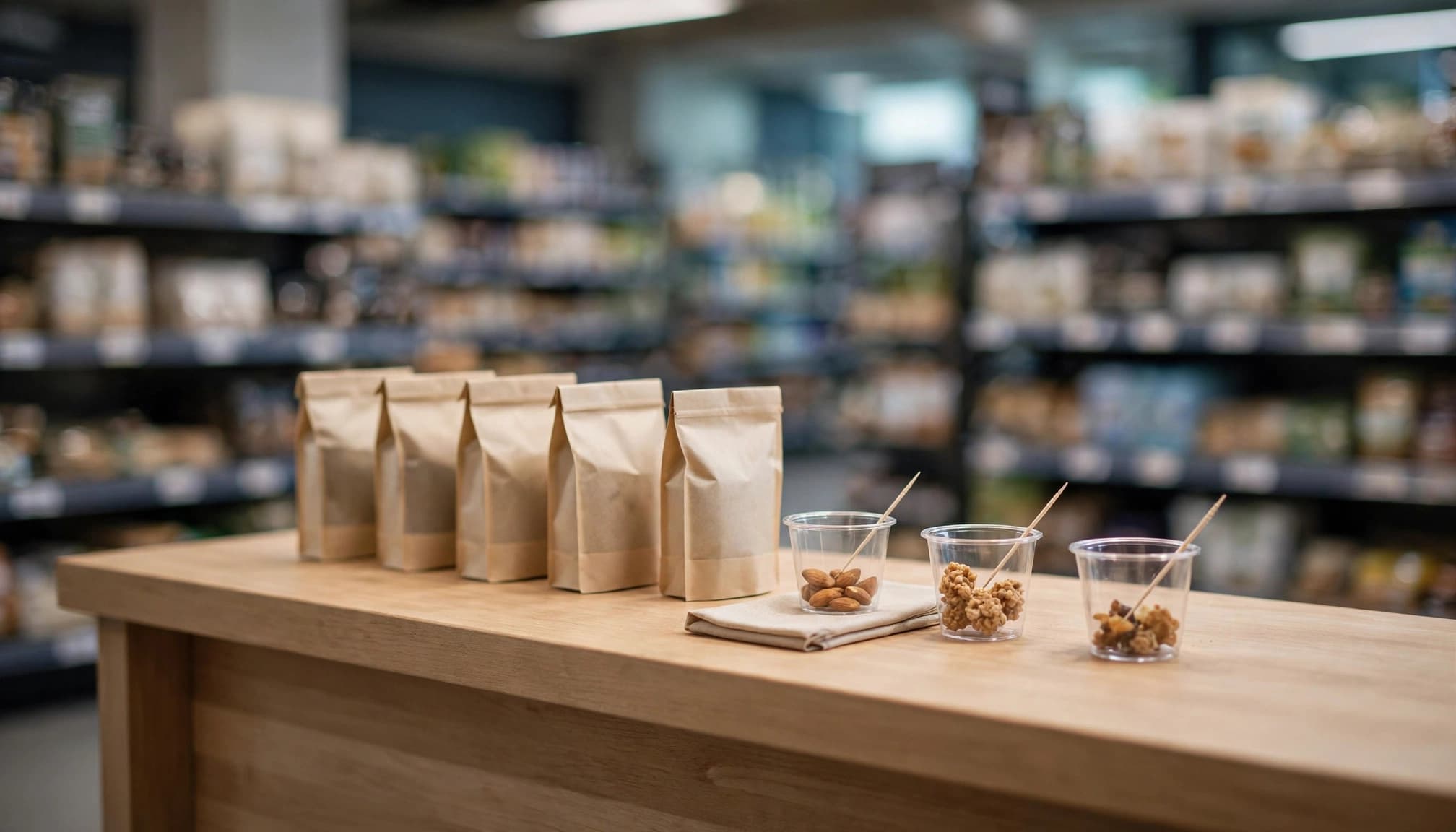
Samples and testers help shoppers judge a product before buying. A food brand might offer bite-size samples, while a skincare display could provide sealed testers with disposable applicators. For products that need explanation, a brief, staff-led demonstration can show how an item works without creating a long stop in the aisle.
Keep the setup tidy and comfortable to use. Provide a clear place for used applicators or sample wrappers, replenish supplies on a schedule, and keep products within easy reach. Choose demonstrations that store associates can repeat safely and quickly, with straightforward instructions and no special tools.
Add a digital feature with a clear purpose
A QR code can offer details that do not fit on a sign, such as a short product demo, usage instructions, or a coupon. A screen may help when a quick visual demonstration answers a common question. However, the display should still explain the product and offer without requiring a phone or a wait.
Place the code where shoppers can scan it without blocking the aisle, and test the link on common phones before launch. Keep the destination focused on one useful next step. For campaign measurement, compare scans or coupon redemptions across locations; Bitly’s QR code campaign guidance outlines ways to track engagement.
Localize the message for shoppers in each market
A single campaign can feel more relevant when its featured products or copy reflect local preferences. A store near a college might highlight convenient meal options, while another location could feature products tied to a regional event or seasonal need. Customer feedback and sales patterns can help teams decide what to emphasize.
Personalization does not require a different display structure for every store. Keep the core design consistent, then adapt a headline, offer, or product mix for groups of locations. For more ideas, see these localized messaging strategies for retail displays. In every market, keep the offer easy to understand and the product at the center.
Make sustainability and flexibility part of the display
A retail display should attract shoppers while fitting the campaign’s practical needs. Material choice, reusable parts, shipping, and replenishment all affect how well it performs after it reaches the store.
Choose materials that support a lower-waste design
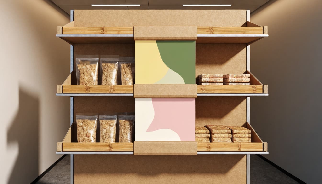
Recycled paperboard can work well for lightweight products and short promotions. For longer use or heavier items, consider stronger construction or materials such as bamboo, selected for its durability and appearance. Bioplastics may suit some components, but their end-of-life options depend on the material and local collection systems.
Match strength to product weight and display lifespan. Reinforce stress points, such as the base and shelf connections, rather than making every panel heavier. Also consider how the unit will be separated or recycled after the campaign. The FTC’s Green Guides for environmental claims can help brands avoid broad or unsupported statements about recyclability and environmental benefits.
Use modular parts for changing campaigns
A sturdy structure can support more than one promotion when teams can replace graphics, adjust shelves, and reuse key components. For example, a display might keep the same frame while a new campaign panel and product assortment update its look. That can reduce the need to build a fully new unit for each promotion.
Modularity works best when parts are easy to identify, store, and assemble. Keep the number of separate pieces low, and make changes possible without special tools or complicated instructions. Before approving the design, test how quickly staff can swap components and confirm that the updated unit remains stable with its new product load.
Design for easy stocking and a neat appearance
Shoppers should be able to see and reach products without shifting the display. Use shelves or trays that keep items upright as stock runs low, and leave enough space for staff to replenish them without dismantling the structure. Check stability when the unit is both full and partly empty, especially if products vary in weight.
Store teams also need a clear path from carton to sales floor. Include simple assembly instructions, accurate product and component counts, and protective packing that helps prevent damage during transit. Retail-ready preparation and POS and POP display assembly services can help units arrive organized and consistent. Test the packed display and replenishment process before launch so the finished setup stays practical as well as eye-catching.
Choose the right idea and measure its results
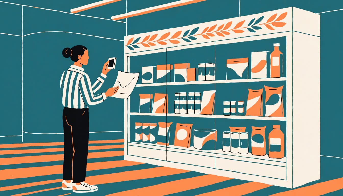
Turn a display idea into a brief before choosing its final format. Match the concept to the shopper, product, store space, budget, and campaign goal. A compact counter unit may suit an impulse item, while a larger floor display may work better for a product launch with more to explain.
Plan around the store and campaign
Start with one primary goal, such as increasing trial, moving seasonal inventory, or encouraging shoppers to add a related product. Then check whether the display’s footprint, product capacity, and message fit the stores and shoppers you want to reach. Keep the structure and materials within budget, including shipping, setup, replenishment, and removal.
Confirm retailer specifications early. Requirements can affect display dimensions, placement, labeling, packing, delivery windows, and how store teams assemble the unit. Test a full-size version with actual products and packaging before launch. That can catch problems with stability, visibility, stocking, or shipment that a design mockup won’t reveal. For more planning considerations, see our guide to retail display campaign planning and measurement.
Set a baseline and track a few useful measures
Before shipping displays, record the participating stores, campaign dates, product assortment, price, and any related promotions or advertising. Also capture recent sales for the featured product. Choose two or three measures that fit the goal:
- For a product trial, compare units sold or sell-through, the share of available product sold during the campaign.
- For a cross-sell display, track units per transaction, average basket size, or relevant category sales.
- For a QR offer, count scans or redemptions, alongside sales.
- For a complex setup, record whether displays arrived, were placed on time, and stayed stocked and shoppable.
Where possible, compare display stores with similar stores that did not receive the display. Match store format and past sales, and use the same campaign dates. This helps estimate lift, but other differences, such as local promotions or stock levels, can still affect the comparison. Circana’s sales lift overview explains why campaign results need a clear baseline.
Start with a small group of stores before expanding. Review sales alongside store photos and brief staff feedback; those details can show whether a weak result came from the idea, placement, or execution. Use the pilot findings to adjust the display and rollout plan before committing to a wider launch.
Frequently Asked Questions
A strong display still needs to fit the retailer, promotion, and product. These answers address practical decisions that can come up after choosing a design.
Can one display design work for every retailer?
A core design can often support several retailers, but its dimensions, graphics, product mix, or shipping setup may need changes. Confirm each retailer’s placement and receiving rules before production. Research on how different in-store display types affect consumer behavior also supports choosing a format for its specific setting rather than assuming one design fits all.
When should I remove or refresh a retail display?
Keep the display up while its product, offer, and placement remain relevant and it stays stocked and presentable. Remove or refresh it when the promotion ends, the featured product changes, or the unit becomes damaged or difficult to shop. Set the planned run dates before launch so store teams know when to update it.
Is a display useful when the product already has shelf space?
It can be, if it gives shoppers a useful reason to notice the product, such as a seasonal offer or a related item placed nearby. However, a display that simply repeats the shelf presentation may not add much. Give it a distinct role, then check whether the placement supports the campaign without disrupting the store.
What should I check if shoppers notice a display but sales stay flat?
First, check whether the display stayed in its planned location, remained stocked, and showed the current price and offer clearly. Then look at product availability and competing promotions, since either can affect sales. Store photos and staff feedback can help pinpoint a problem that sales totals alone won’t explain.
Should I choose a custom display or a floor-ready format?
Choose based on product requirements, retailer rules, and how much setup stores can reasonably handle. A custom unit may suit an unusual assortment or a specific footprint, while a pre-assembled option can reduce in-store assembly work. Explore floor-ready POS display options when quick, consistent placement is a priority.
Conclusion
In 2026, effective retail displays pair a clear message with relevant placement, easy product access, and reliable store execution. The right approach depends on the campaign and shopping context, so choose ideas that fit your product and test them on a small scale before expanding.
Then compare results with your original measures, and review store photos and feedback alongside sales. Use what you learn to refine future displays, because a shopper’s first glance only matters when the product is clear, reachable, and ready to buy. See our retail pallet display design tips for another practical display format to consider.
